Reading time 3 minutes.
Pantone is a North American company headquartered in Carlstadt, New Jersey. It is best known for its Pantone Matching System (PMS), a colour system that is used in a variety of industries – especially in graphic, product, and fashion design – because it offers maximum support in the management of colour from design to production, in both digital and physical formats, among a wide range of base materials.
The history of Pantone, originally a printing company called M & J Levine Advertising, dates back to the 1950s. In 1956, the company’s founders, brothers Mervin and Jesse Levine, who were both advertising executives, hired Lawrence Herbert, a recent graduate of Hofstra University, as a part-time employee.
Herbert used his knowledge of chemistry to systematise and simplify the company’s pigment stock and colour-ink production. This led to his taking charge of the ink division, where he had turned a profit by 1962, while the commercial division was $50,000 in debt. Herbert subsequently purchased the company’s technology assets from the Levine brothers for $50,000 and renamed the company Pantone.
In 1963, the 500-shade Pantone Matching System (PMS) was first introduced. In the years that followed, the PMS was continually expanded and became the standard when it came to specifying colours in graphic design and art.
The idea behind PMS is to enable designers to “colour match” specific colours when a design enters the production stage, regardless of the equipment used to produce the colour. On account of its ability to reproduce colours faithfully and act as a consistent reference point in the manufacture of products, the system has been widely adopted by graphic designers and print houses worldwide.
Pantone’s success with its swatches and other products paved the way for major development and expansion. This resulted, for example, in the Pantone Color Institute, which was founded in the mid-1980s in order to develop the colour palette further and provide support to designers. In the late 1990s, having established itself relatively successfully on the market, its management decided to consolidate its position by selecting and declaring a “Colour of the Year”.
Every year, Pantone identifies the colour that best reflects the current mood and expectations of society. The process of choosing the Colour of the Year involves market research, trend analysis, expert advice and consultations with designers and fashion experts. The Colour of the Year is then presented as a symbol of new beginnings, inspiration and hope.
The Colour of the Year was first announced in late 1999, with a grey-blue shade called Cerulean (carrying the internal Pantone designation 15-4020) becoming the colour of 2000. In subsequent years, there has always been one colour per year, the only exceptions being the two-colour years of 2016 and 2021.
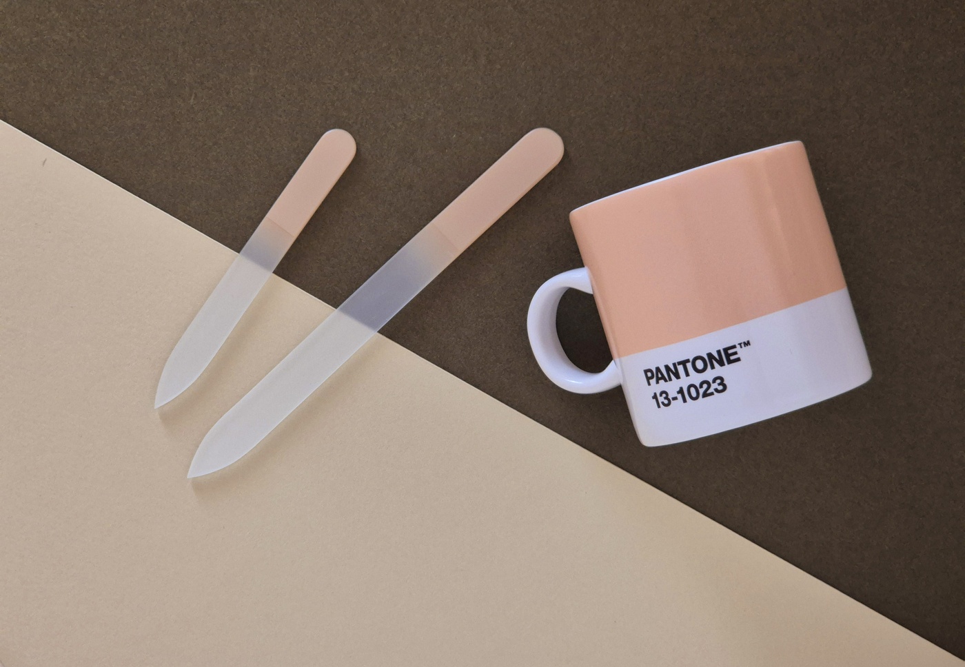
In 2024, the Colour of the Year is PANTONE 13-1023, otherwise known as Peach Fuzz. This velvety peach shade by Pantone Color Institute captures our desire to nurture ourselves and others, and its all-embracing spirit enriches the mind, body and soul.
“In seeking a hue that echoes our innate yearning for closeness and connection, we chose a colour radiant with warmth and modern elegance. A shade that resonates with compassion, offers a tactile embrace, and effortlessly bridges the youthful with the timeless,” said Leatrice Eiseman, executive director of the Pantone Color Institute, in reference to the colour of 2024.
Pantone is more than just a provider of colour systems; it is also a trendsetter and a source of inspiration.


